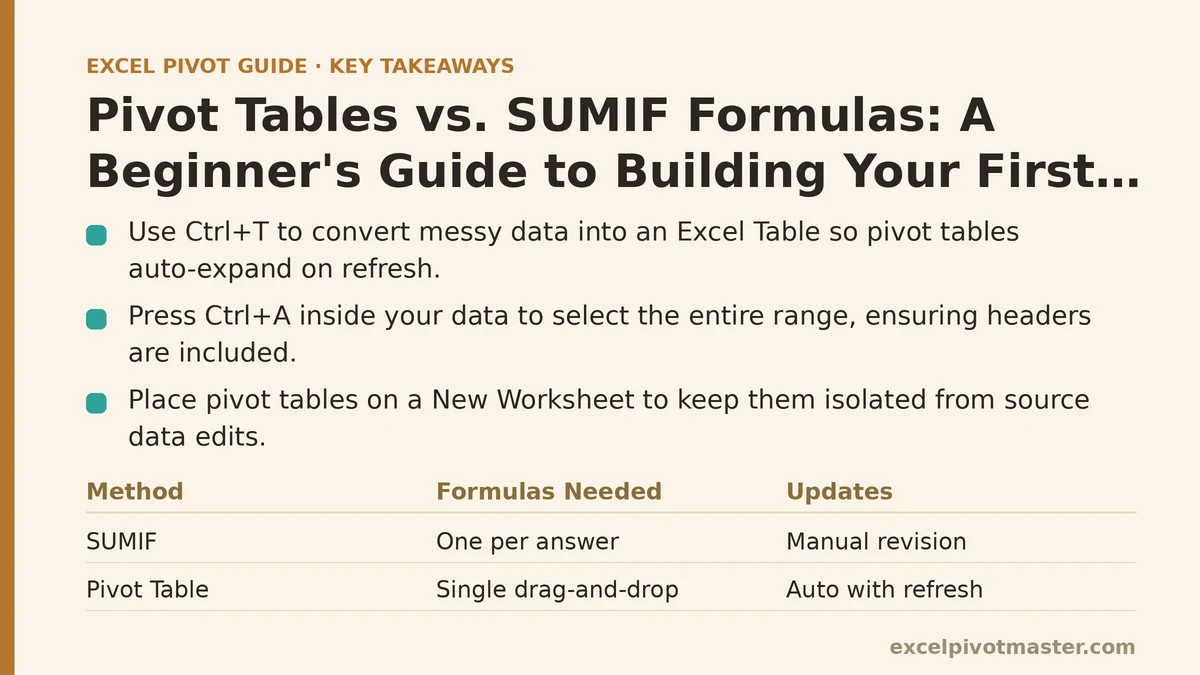
The difference between a pivot table and a SUMIF formula comes down to one question: do you want to write one formula per answer, or do you want Excel to generate all the answers from a single drag-and-drop? If you have 12 sales regions, a SUMIF approach means 12 separate formulas — one for each region, plus more if you want quarterly breakdowns on top of that. A pivot table replaces all of them with a single field drag, and it updates automatically when the source data changes, which no set of static formulas can do without manual revision.
If you’ve never built one before, the process takes about four minutes the first time. This guide walks through every step in order, including the two mistakes beginners make most often — selecting the wrong data range and putting fields in the wrong area — so you can avoid them before they cost you an hour of confusion.
What You’ll Need Before You Start
A pivot table requires one thing: a properly formatted table of data. That means:
- Column headers in the first row. No merged cells, no blank columns, no title text sitting above your headers.
- No completely blank rows or columns anywhere inside the data range. One blank row is fine if it separates the table from other content below, but a blank row inside the data breaks everything.
- One data type per column. A “Sales” column should contain numbers only, not a mix of numbers and text like “$1,200” in some cells and “1200” in others.
If your data is currently a mess of merged headers or stray blank rows, select the range, press Ctrl + T to convert it to an Excel Table first. Tables handle expansion automatically, which means your pivot table will pick up new rows when you refresh without you re-selecting the range. That one habit saves more time than any other single step in this process.
Step 1: Select Your Data Range
Click any single cell inside your data table, then press Ctrl + A to select the entire contiguous range. You’ll know the selection is correct if every row and column of your data is highlighted, with no gaps in between.
The critical detail: make sure your selection includes the header row. If you accidentally start your selection on row 2, Excel will treat your column headers as data values, and you’ll see odd items like “Region” and “Sales” showing up as row labels instead of field names. In practice, the simplest way to avoid this — and every other range-selection mistake — is to use Ctrl + T to create a proper Excel Table, then click anywhere inside it and skip straight to Step 2.
Step 2: Insert the Pivot Table
With your range selected, go to the Insert tab on the ribbon and click PivotTable. A dialog box opens with two questions:
- Select a table or range: This should already show your selected range. If it doesn’t, click the field and re-select.
- Choose where to place the report: Pick New Worksheet for a clean, unfiltered view. Pick Existing Worksheet only if you have a specific reason to embed the report next to your source data — otherwise, the new worksheet keeps your pivot table isolated from accidental edits.
Click OK. A blank pivot table appears on a new worksheet, with the PivotTable Fields pane open on the right side of your screen.
If you don’t see the Fields pane, click anywhere inside the pivot table and it should reappear. If it still doesn’t, go to PivotTable Analyze → Field List to toggle it back on.
Step 3: Understand the Four Areas Before You Drag Anything
The Fields pane has a checklist of your column names at the top, and four drop zones below it. Each zone does something different:
| Zone | What it does | Example |
|---|---|---|
| Filters | Slices the entire report by one or more values | Show only Q1 data, or only the East region |
| Columns | Creates one column per unique value in the field | One column per month, one per quarter |
| Rows | Creates one row per unique value in the field | One row per sales region, one per product category |
| Values | Performs the calculation (sum, count, average) | Sum of sales, count of orders |
The single most common beginner mistake is dragging a field like “Sales” into Rows instead of Values. That produces a list of every individual sales amount, one row each, which is not what you want. Sales is a number — it belongs in Values. Region is a label — it belongs in Rows.
Rule of thumb: labels go left, numbers go right. Category, region, month, product name — drag those to Rows. Sales, quantity, revenue, margin — drag those to Values.
Step 4: Build Your First Layout
For the classic “sales by region” report:
- In the Fields pane, check the box next to Region — it automatically lands in the Rows area.
- Check the box next to Sales — it automatically lands in the Values area.
That’s it. Your pivot table now shows one row per region, with total sales summed for each region. If you have 12 regions, you’ll see 12 rows plus a Grand Total row at the bottom.
If the calculation shows Count of Sales instead of Sum of Sales, it means your Sales column contains blank cells or text somewhere. Excel defaults to counting when it detects non-numeric values. Right-click the field in the Values area, choose Summarize Values By, and select Sum — but also check your source data, because blanks in a numeric column will keep causing this problem.
Step 5: Add a Second Dimension
The real power shows up when you drag a second field into Columns. Drag Month into the Columns area. Your report now shows regions running down the rows and each month across the columns, with a sales total at every intersection.
If your dates appear as an unreadable string of numbers — like “45123” — right-click any date cell, choose Group, and select Months (or Quarters, or Years, depending on what you need). Excel groups the raw dates into readable month names automatically.
For a second row dimension, drag Product Category into the Rows area below Region. You’ll get each region, then each product category nested underneath it, with subtotals per region and a grand total at the end. To see the same data as a flat list instead of nested, go to Design → Report Layout → Show in Tabular Form.
Step 6: Sort, Filter, and Refresh
Three quick actions turn a raw pivot table into something you can present:
- Sort by value: Right-click any number in the Values area, choose Sort, and pick Largest to Smallest. This reorders the rows by their totals, so your best-performing region appears at the top.
- Filter a single field: Click the dropdown arrow next to Row Labels, uncheck the categories you don’t want to see, and click OK. This hides those rows from the report without deleting anything from your source data.
- Refresh when data changes: Any time you edit or add rows to your source data, right-click the pivot table and choose Refresh (or press Alt + F5). Until you refresh, the pivot table is showing a snapshot of the data from when you last updated it — not the current state.
The refresh step catches more people than any other. You add five new rows of sales data, switch back to the pivot table, and the numbers haven’t changed. That’s not a bug — the pivot table only updates when you tell it to. Get into the habit of refreshing before you trust any number on screen.
Step 7: Fix the Three Most Common Beginner Breakages
“PivotTable field name is not valid” error: Your source data has a blank column header. Every column in your selected range needs a unique name in the first row. Rename the blank column something like “Notes,” or remove it from the selection entirely.
The pivot table isn’t picking up new rows: You selected a fixed range instead of a table, so new rows fall outside the pivot’s range. Convert your source to an Excel Table (Ctrl + T), then go to PivotTable Analyze → Change Data Source and point the pivot at the table name instead of a fixed range.
Values show “Count” instead of “Sum”: Your numeric column has blank cells or text entries. Fill in the blanks, or strip out text that shouldn’t be there, then right-click the Values field → Summarize Values By → Sum.
Quick Reference: The First Pivot Table Checklist
| Step | Action | Where in Excel |
|---|---|---|
| 1 | Format source data as a table | Ctrl + T |
| 2 | Insert the pivot table | Insert → PivotTable |
| 3 | Put labels in Rows, numbers in Values | PivotTable Fields pane |
| 4 | Add a second dimension | Drag Month to Columns, or Category below Region in Rows |
| 5 | Group dates if needed | Right-click date → Group → Months |
| 6 | Sort by your largest value | Right-click value → Sort → Largest to Smallest |
| 7 | Refresh after editing source data | Right-click → Refresh, or Alt + F5 |
Building a pivot table is a four-minute process once you know the pattern. The pattern is simple: format the data as a table, insert the pivot, drag labels to rows and numbers to values, add dimensions until the report answers your question, and refresh whenever the source changes. The first pivot table you build will be serviceable — the tenth will be faster than typing a single SUMIF formula.
Your next step today: open the file with the data you’ve been manually summarizing, convert it to a table, and build one pivot table that answers a question you currently answer with formulas. Time the process. It will be quicker than you expect, and it’s a skill that carries over to every spreadsheet you touch from here on.
Related guides: How to Create Your First Pivot Table in Excel: A Complete Beginner’s Guide, How to Count Unique Values in Excel Pivot Tables: Myths vs. Reality, and Power Query vs Pivot Tables: When to Use Each (Ranked by Task).