By the end of this post, you’ll be able to insert a slicer on any pivot table, add a timeline filter for date fields, connect both to more than one pivot table at once, and recover when the buttons stop responding or disappear. The walkthrough assumes you already have a working pivot table summarizing something like sales by region by month.
Slicers and timelines turn a static pivot table into a filter panel anyone can click without understanding the field list. A slicer is a floating set of buttons, one per unique value in the field it controls. A timeline is the same idea for date fields, but rendered as a horizontal bar with year, month, or day increments you drag across. Both write back into the pivot’s filter state immediately, and both stay visible when you click outside the table.
What Is the Difference Between a Slicer and a Regular Filter Dropdown?
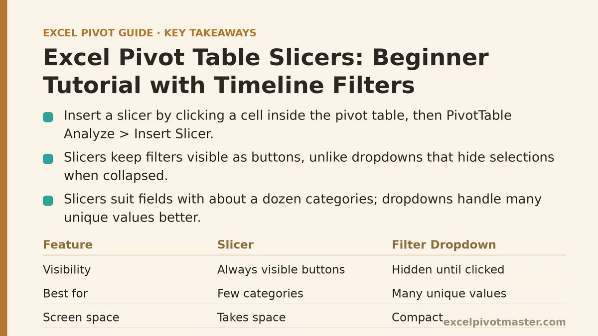
A filter dropdown lives inside the field’s header cell and collapses to an arrow when you click away. Only the person who knows to click that arrow can see what is currently filtered. A slicer is a separate object sitting on the sheet, always visible, showing every available value as a button and highlighting the selected ones.
That visibility matters when a workbook gets shared. A filtered dropdown can hide rows without anyone noticing, which is how a summary ends up reading one region’s numbers while the title says the report covers all regions. A slicer removes that ambiguity because the selected buttons sit there in plain view for every reader.
The tradeoff is screen space. A slicer for a field with 200 unique values becomes a wall of buttons; the dropdown handles that case better. Slicers work best for fields with a dozen or so categories: Region, Product Line, Sales Rep, Status, Warehouse.
How Do I Add a Slicer to My Pivot Table?
Click any cell inside the pivot table first. This is the step people skip, and it is why the Slicer button sometimes appears greyed out.
- On the PivotTable Analyze tab, click Insert Slicer.
- A dialog lists every field in the pivot’s source. Tick the ones you want button sets for. Start with one or two fields — Region and Product Category, for example.
- Click OK. Excel drops a slicer box onto the sheet near the pivot table.
- Drag it wherever you want. Grab a corner to resize it; more height or width reveals more buttons before a scrollbar appears.
- Click a button to filter. Ctrl+click to select multiple non-adjacent buttons. Shift+click to select a range of adjacent ones.
The pivot table recalculates the instant a button is clicked. There is no Refresh step needed because the slicer is filtering the pivot cache directly, not the underlying cells.
To clear a slicer, click the funnel-with-red-X icon in the slicer’s top-right corner. This resets that slicer only; other slicers on the sheet keep their selections unless they share a cache and you clear them too.
What Choices Do I Have for Slicer Appearance and Layout?
Right-click the slicer and choose Slicer Settings for the behavioral options, and use the Slicer tab on the ribbon (which appears whenever a slicer is selected) for the visual ones.
- Caption — rename the header text above the buttons. Useful when the field name is cryptic, like a database column called
RGN_CD. - Columns — controls how many button columns the slicer shows before wrapping. Setting this to 2 or 3 makes a long value list far easier to scan.
- Button height and width — under the Slicer tab, adjust in small increments. Wider buttons fit longer product names without truncation.
- Sort order — right-click the slicer and use Sort to arrange buttons alphabetically, by the source data’s order, or by the measure value if the slicer controls a field used in the Values area.
- Styles — the Slicer Styles gallery offers color variants. Pick one with strong contrast between selected and unselected buttons so the current filter state is obvious at a glance.
A common mistake is sizing a slicer too small and leaving it that way. When a value doesn’t fit, the button truncates with an ellipsis and readers cannot tell two long product names apart. Give buttons enough width to show their full text, and add columns before you add height.
How Does a Timeline Filter Work Differently from a Slicer?
A timeline is a dedicated date slicer. It requires a field that Excel recognizes as a true date — not text that looks like a date. If your date column is stored as text, the Insert Timeline button will appear greyed out even with a cell in the pivot selected.
Once a valid date field is available:
- Click inside the pivot table, go to PivotTable Analyze → Insert Timeline.
- Tick the date field, click OK.
- The timeline appears as a horizontal bar segmented into periods. The dropdown in its top-right corner switches the view between YEARS, QUARTERS, MONTHS, and DAYS.
- Click a segment to filter to that period. Drag across two or more segments to filter a range, such as January through March.
- To narrow to a specific window rather than a whole segment, drag the handles at either end of the selected region inward. The timeline shows the resulting date range as text.
The connection between slicers and timelines becomes clear at this point: both write to the same filter state. A slicer on Region and a timeline on Order Date stack together, so you can show the South region for Q2 only, and both selections stay visible on the sheet.
If Insert Timeline stays greyed out with a cell selected, right-click the date column in the source data and check its number format. A value that left-aligns in the cell is text and needs converting, either via Text to Columns on the Data tab or by re-entering the dates with a real date format applied.
Can I Use One Slicer to Control Several Pivot Tables?
Yes, and this is where slicers pull ahead of filter dropdowns. A single slicer can drive every pivot table that shares the same pivot cache.
To connect one slicer to another pivot table on the same sheet or a different one:
- Right-click the slicer and choose Report Connections (older builds label it PivotTable Connections).
- The dialog lists every pivot table in the workbook. Tick the ones the slicer should control.
- Click OK. Filters now apply to all ticked tables in step.
The catch is the cache. Two pivot tables built at different times from the same source range often have separate caches, and a shared slicer cannot bridge them. You will see this as a pivot table that is greyed out or missing from the Report Connections list. The reliable fix is to build one pivot table first, then create the others by copying that finished table and re-pointing it, so every table inherits the same cache. Press Ctrl+Alt+F5 afterward to refresh all caches if the tables still behave independently.
Timelines connect the same way, through their own Report Connections dialog, so one drag across a quarter can filter four separate pivot tables at once.
Why Did My Slicer Stop Filtering the Table?
Working through the usual causes in order saves the most time:
- The table you expect to be filtered is not connected. Open Report Connections and confirm it is ticked. Greyed-out entries mean a separate cache, not a broken slicer.
- You added new rows to the source and only refreshed one table. A pivot table with its own cache still holds old values, and its filter buttons no longer line up with the data. Refresh that table or unify the caches.
- The slicer is hiding a value not currently in the data. Deleted regions sometimes linger in slicer button lists the same way they linger in row labels. Right-click the pivot table → PivotTable Options → Data tab → set Number of items to retain per field to None, then refresh. The stale buttons disappear.
- The slicer was moved but the sheet was protected. On a protected sheet, slicers become read-only unless you allow their use under the protection settings.
- The file was closed and reopened. Slicer selections persist through save and reopen, which surprises people who expect filters to reset. Click the clear-filter icon to start fresh.
Should I Use Slicers, Timelines, or Both?
Use this decision branch:
- Your filter field has under about 15 unique values — a slicer. Button sets scan faster than dropdowns at that size.
- Your filter field has dozens to hundreds of unique values — a dropdown filter, or a slicer sorted by measure value so the meaningful buttons float to the top.
- Your filter field is a date — a timeline. It handles years, quarters, months, and days in one control and requires no button list at all.
- You need more than one pivot table filtered the same way — slicers and timelines connected through Report Connections, provided the tables share a cache.
- The workbook will be read by people unfamiliar with Excel — both. Slicers for the categorical cuts, a timeline for the date window, and everything stays visible as the reader clicks.
A pivot table with two slicers and one timeline typically replaces what would otherwise be a fresh field-list drag every time someone wants a different cut. That is the entire point of the feature: filter state as a permanent, visible control panel rather than a hidden dropdown.
Common Mistakes and How to Recover
Building each pivot table separately and expecting a shared slicer to work. Recover by rebuilding the extra tables from the first one via copy and re-point, or accept separate slicers per table.
Storing dates as text. Recover with Text to Columns: select the column, Data → Text to Columns, keep delimited settings, set the column format to Date, finish, then refresh. The timeline becomes available.
Leaving slicers unlabeled. A slicer box shows the field name as its caption only if you leave the default. Rename it under Slicer Settings → Caption so readers know whether a button set is filtering Region, Product, or Channel.
Sizing buttons too narrow. Recover by right-clicking and setting Columns and Button width to values that fit the longest label. A truncated product name is a filtering error waiting to happen.
Assuming the slicer applies to the whole workbook. It applies only to connected tables. Anything on another sheet, or a chart fed from pivot output cells, is a separate matter and may need its own connection or a source range adjustment.
What to Do Next
Open the pivot table you use most often and set up a filter panel today:
- Insert a slicer on one categorical field with a dozen or so values — the one you filter by most often.
- If the pivot has a date field stored as true dates, insert a timeline on it and set the view to MONTHS.
- Right-click each control and open Report Connections to see whether any other pivot table in the workbook can share it.
- Check that your source date column is formatted as a date, not text, so future timelines insert cleanly.
Those four steps take a few minutes and convert a pivot table from a snapshot into an interactive report. If a slicer misbehaves later, the answer is almost always in Report Connections or the cache, so start there before rebuilding anything.
Related guides: How to Add Slicers to Your Pivot Table: A Beginner’s Step-by-Step Checklist, Pivot Table Slicers: Complete Beginner Guide, and How to Create Your First Pivot Table in Excel: A Complete Beginner’s Guide.