By the end of this post, you’ll know how to produce five distinct percentage views from the same pivot table — share of the grand total, share within a column, share within a row, share within a parent group — and, more importantly, how to tell which one a request actually calls for before you build it. That last part is the part people skip, and it’s the reason so many “percentage of total” columns in finished reports quietly answer a question nobody asked.
The mechanics of turning a value field into a percentage are simple enough that most people learn them in five minutes and never think about them again. The trouble shows up later, when a report gets restructured, a filter gets applied, or someone adds a second row level, and the percentages keep displaying numbers without ever telling you they’ve stopped meaning what they used to mean. Walking through one report from start to finish is the fastest way to see where that happens.
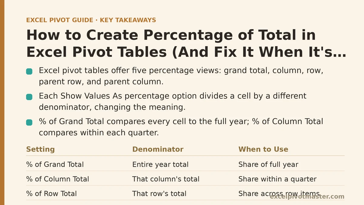
Setting Up the Base Report
Start with a straightforward layout: Region in the row area, Quarter across the columns, Revenue in the values area. Five regions, four quarters, one number in each cell. Nothing unusual yet — this is the pivot table equivalent of a clean intersection, the kind that shows up in almost every sales, expense, or operations report built in Excel.
Drag Revenue into the Values area a second time, so two identical columns of the same number sit side by side. Right-click the second copy, choose Show Values As, and you’ll find a list of options that goes well beyond the plain “% of Grand Total” most people expect: % of Row Total, % of Column Total, % of Parent Row Total, % of Parent Column Total, % of Parent Total, and a couple of comparison options that aren’t percentages of a whole at all. Each one divides the cell’s value by a different denominator, and that denominator is the whole story.
Pick % of Grand Total first, since it’s the one most people reach for by habit. Every cell now shows what fraction of the entire year’s revenue that specific region-quarter combination represents. The Southeast’s Q1 number might read 4.2%, meaning that single cell accounted for 4.2% of everything the company sold across all regions and all four quarters combined. That’s a real number, and it’s not wrong — it’s just answering one very specific question, and it’s worth pausing here before assuming it’s the question you were asked.
The Request Changes: Share Within a Quarter, Not Share of the Year
Suppose the actual ask was different: leadership wants to know how each region performed relative to that quarter, not relative to the full year. A region that’s small in absolute terms might still be pulling well above its weight in a particular quarter, and % of Grand Total buries that entirely, since every cell is being measured against the same twelve-month denominator regardless of which column it sits in.
This calls for % of Column Total instead. Right-click the same field, go back into Show Values As, and switch the setting. Now each cell divides by the total of its own column — Q1’s regions all divide by Q1’s total, Q2’s regions all divide by Q2’s total — so the five percentages in any given quarter column will sum to 100%, and the comparison becomes about standing within that quarter rather than standing across the whole year.
The difference is easy to miss if you only glance at one cell in isolation. Southeast’s Q1 might read 4.2% under Grand Total and 11.8% under Column Total, and both numbers are correct — they’re just measuring two different things. Grand Total tells you Southeast’s overall footprint across the year; Column Total tells you Southeast’s competitive position within Q1 specifically. Confusing the two in a slide deck is how a modest region ends up looking bigger or smaller than it should, depending entirely on which base the presenter happened to leave selected.
% of Row Total flips the same logic the other direction. Instead of comparing regions within a quarter, it compares quarters within a region — each of the four quarter values for Southeast now divides by Southeast’s own annual total, showing what portion of Southeast’s year happened in each quarter. That’s the number you’d want if the question is seasonality within a region rather than competitive standing across regions.
Adding a Second Row Level Complicates the Math
The report grows, as reports tend to do. Someone asks for Product Line nested underneath Region, so the row area now has two levels: Region on the outside, Product Line inside it. The immediate follow-up question is predictable — what share of each region’s revenue does each product line represent?
Reaching for % of Column Total at this point produces something misleading. That setting still divides every cell by its column’s grand total, which means a product line’s percentage is now being measured against the entire quarter’s revenue across all regions combined, not against its own region’s slice of that quarter. The number will look plausible — it’s still a percentage between 0 and 100 — but it answers a question nobody asked, and it will be a small, oddly deflated-looking figure compared to what the reader expects.
The setting built for exactly this situation is % of Parent Row Total. It divides each product line’s value by the total of its immediate parent in the row hierarchy — in this case, the region it belongs to — rather than by the grand column total. Select it, and each product line’s percentage now correctly reflects its share within its own region, and the product lines nested under any single region will sum to 100% for that region.
There’s a sibling setting worth knowing about here: % of Parent Total, which lets you pick which field in the hierarchy counts as the “parent” through a Base Field dropdown, rather than assuming it’s always the field one level up. That flexibility matters once a row area has three or more nested levels, since “parent” stops being an obvious, single answer and becomes a choice you have to make explicitly.
When the Percentages Stopped Adding Up to 100%
Everything checks out until someone collapses the Southeast group to tidy up the screen before a meeting, and the percentages inside it suddenly look off — not wildly wrong, just inconsistent with what they showed a minute earlier when the group was expanded.
Nothing about the underlying data changed. What changed is that collapsing a group doesn’t remove the data from the calculation, but it can change what’s visibly displayed while the pivot cache still computes against the full set underneath. The confusion usually isn’t a math error at all — it’s a mismatch between what’s on screen and what the reader assumes is on screen. A collapsed subtotal row showing 100% is correct on its own terms; the trap is a viewer assuming the visible rows above it still tell the whole story once one branch has been tucked away.
The more common version of this problem shows up with filtering rather than collapsing. Filter out one region entirely, and every percentage recalculates against whatever remains visible — the denominator shrinks the moment a region disappears from the filter, and every other region’s share grows to compensate, even though nothing about their actual revenue changed. This is expected behavior, the same underlying mechanic that makes running totals shift after a filter is applied, but it catches people off guard because a percentage column looks like it should represent something fixed. It doesn’t. It represents a share of whatever is currently in view, and that view is only as stable as the filter sitting on top of it.
The fix isn’t a setting to toggle — it’s a habit: before trusting a percentage of total figure, check whether any filter is active and whether it’s hiding something that would change the denominator. If the report needs to show a share that stays constant regardless of what a user filters afterward, the standard Show Values As option isn’t the right tool. That requirement points toward a DAX measure built in the Data Model, since a measure can be written to reference the full, unfiltered table no matter what the visible pivot table currently displays.
The Negative Number Problem
One region in this dataset processes a batch of refunds late in the year, and its Q4 revenue comes out negative. That single negative cell has an outsized effect on every percentage in the report, because the grand total the other regions are dividing against now includes that negative value pulling the denominator down.
The practical result: regions with perfectly ordinary positive revenue can show percentages above 100%, or a small positive region can appear to represent a disproportionately large share of the total, purely because the denominator shrank when the refund got subtracted from it. Nothing about the calculation is broken — dividing a positive number by a smaller-than-expected total legitimately produces a larger percentage — but the output looks alarming to anyone reading the report without knowing a refund sits buried in the numbers.
There’s no single settings fix for this one, because the math is doing exactly what it’s supposed to do. The fix is presentational: either separate refunds into their own row or field so they’re not silently netted into a revenue total that percentages are then calculated against, or add a note next to the percentage column flagging that a negative adjustment is included in the denominator for that period. A reader comparing percentages across quarters deserves to know when one of those quarters includes a subtraction the others don’t.
What This Case Teaches You About Choosing a Base Field
Every stage of this report needed a different denominator, and every stage looked correct on screen right up until someone asked a slightly different question than the one the pivot table was set up to answer. That’s the pattern worth carrying forward: a percentage of total is only as trustworthy as the base it was calculated against, and Excel will compute that base faithfully whether or not it matches what the reader has in mind.
Before applying any of the Show Values As percentage options, it helps to answer one question out loud: percentage of what, relative to what group? “Share of the whole year” calls for Grand Total. “Share within this specific quarter” calls for Column Total. “Share within this specific region” calls for Row Total or Parent Row Total, depending on whether the hierarchy has one row level or several. Skipping that question is how a technically correct percentage ends up telling a misleading story in a room full of people who won’t think to ask which base it came from.
A few quick checks are worth running through anytime a percentage column looks suspicious: confirm no filter is quietly shrinking the denominator, confirm no group is collapsed in a way that hides context the reader assumes is visible, and confirm no negative value is sitting in the total being divided against. Those three cover the overwhelming majority of “these percentages don’t look right” moments, and none of them require rebuilding the pivot table from scratch.
What question is the percentage in your report actually trying to answer — a share of the whole, a share of a column, or a share within a group? That answer tells you which Show Values As setting belongs there. Related guides: How to Create Running Totals in Excel Pivot Tables (The Right Way), Excel Pivot Table vs SUMIF: When to Use Which, and How to Count Unique Values in Excel Pivot Tables: Myths vs. Reality.