By the end of this post, you’ll be able to build a customer segmentation model entirely inside Excel pivot tables — starting with simple demographic slices and progressing to a weighted RFM (Recency, Frequency, Monetary) score that classifies every customer into a meaningful segment. You’ll also learn where pivot tables hit their limit and how to recognize when a segment requires a different tool.
That progression matters because most segmentation advice jumps straight to advanced techniques without establishing the foundation. A beginner needs to see how a pivot table groups customers by a single attribute. An advanced analyst needs to combine multiple attributes into a composite score. Both approaches are valid, but they answer different questions. Working through the beginner path first makes the advanced path far easier to trust, since you’ll understand exactly what the pivot table is doing at each step.
The Beginner Path: Single-Attribute Segmentation
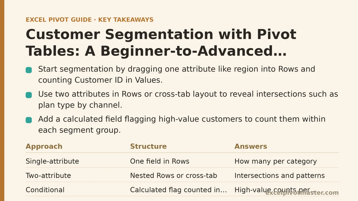
Start with the simplest question: “How many customers do we have in each category?” Pick one column from your customer master data — region, industry, acquisition channel, or plan type — drag it into the Rows area, drag Customer ID into the Values area, and set the value calculation to Count. That single move produces a segmentation table.
What you’re seeing is a distribution of your customer base across one dimension. It answers questions like “How many customers came from organic search?” or “Which region holds the largest share of accounts?” The pivot table handles the counting automatically, and you can sort the results by count to see your largest segments at a glance.
The limitation of single-attribute segmentation becomes clear the moment you ask a follow-up question. Knowing that 40% of customers are in the “Enterprise” plan type doesn’t tell you whether those customers are new or long-standing, profitable or costly, active or dormant. A single attribute flattens the complexity of your customer base into one dimension. That’s fine for a first look, but real segmentation needs to combine attributes.
Two-Attribute Segmentation: The Sliced View
Drag a second field into the Rows area, and the pivot table creates a nested hierarchy. Now your segmentation reads like “Enterprise plan, West region: 214 customers” with subtotals at each level. This is the point where segmentation starts to feel like actual analysis rather than counting.
A better structure for two attributes is the cross-tab layout. Put one attribute in Rows, the other in Columns, and the count in the middle. The result is a grid where each cell represents the intersection of two attributes — for example, acquisition channel across the top and plan type down the side. This layout reveals patterns that stacked rows hide: you can see at a glance whether “Enterprise” customers predominantly arrive through Sales-Led channels while “Self-Serve” customers come from Content Marketing.
Two attributes also unlock conditional segmentation. Add a calculated field that flags high-value customers (for instance, a field that returns 1 if Lifetime Value exceeds a threshold and 0 otherwise), then count that field within each group. The pivot table now shows not just how many customers exist in each cell, but how many of them qualify as high-value. That’s a meaningful step toward strategic segmentation, and it still uses nothing but standard pivot table features.
The Intermediate Step: Behavioral Segmentation with Value Bucketing
Raw values like “Amount Spent” or “Orders Placed” are continuous numbers, and continuous numbers make poor segment boundaries. A customer with $512 in lifetime spend and one with $489 are effectively the same customer, but a raw pivot table treats them as distinct rows. That’s where value bucketing comes in.
Group numeric fields directly in the pivot table: right-click a value in the row area (or the column area), choose Group, and set the starting value, ending value, and step size. Excel creates buckets automatically — $0-$100, $101-$200, and so on. You now have behaviorally defined segments like “Low Spend,” “Mid Spend,” and “High Spend.”
Bucketing works equally well on dates. Right-click a date field, choose Group, and select Months, Quarters, or Years. This turns a messy list of transaction dates into clean behavior windows. Combined with a second bucket — for example, grouping customers by their first purchase date into “New,” “Returning,” and “Long-term” cohorts — you get a two-dimensional behavioral segmentation that starts to resemble what marketing teams call lifecycle stages.
The pitfall at this stage is choosing bucket boundaries that don’t match your business reality. A $100 threshold conversationally means “below average order value” in one company and “top-tier premium account” in another. Use the pivot table’s own summary statistics — average, median, or quartile breaks — to ground your bucket boundaries in the actual distribution of your data, not in round numbers that feel intuitive.
The Advanced Path: RFM Segmentation in a Pivot Table
RFM scoring is the workhorse of customer segmentation. It evaluates each customer on three dimensions: Recency (how recently they purchased), Frequency (how often they purchase), and Monetary (how much they spend). Each dimension gets a score from 1 to 5, and the three scores combine into a segment label.
Most tutorials insist this requires a dedicated analytics platform or at least a complex Power Query transformation. In practice, a pivot table handles RFM scoring with surprising grace, provided you set up the source data correctly.
Step 1: Build the per-Customer Metrics
Your source data needs three columns: Customer ID, Order Date, and Order Value. Create four pivot tables — or one pivot table with multiple value fields — from this same data:
- Recency: Calculate the number of days between each customer’s most recent order and a reference date (use a formula in the source data, like
=TODAY()-MAXIFS(OrderDate, CustomerID, [@CustomerID])). - Frequency: Count the number of orders per customer.
- Monetary: Sum the order value per customer.
- Last Order Date: For reference, the raw date of the most recent order.
Each of these becomes a column in a new table. This intermediate table — call it CustomerRFM — is the foundation. If you’re comfortable with Power Query, consolidate it there; otherwise, copy the pivot outputs into a fresh sheet and clean up the headers.
Step 2: Score Each Dimension on a 1-5 Scale
Now add three more columns to the CustomerRFM table, one per dimension. Use either nested IF formulas or Excel’s PERCENTILE functions to assign scores. A percentile-based scoring is more robust than a fixed-threshold scoring because it adapts to your actual customer distribution rather than assuming a uniform spread.
For each dimension, rank customers into quintiles: the top 20% get a 5, the next 20% get a 4, and so on down to 1. In Excel, =MATCH(PERCENTRANK.INC($C$2:$C$1000, C2), {0, 0.2, 0.4, 0.6, 0.8, 1}, 1) returns a score from 1 to 5 for the value in C2. Copy this pattern for Frequency and Monetary.
The key difference between a 5-point RFM score and a simpler two-bucket approach: RFM captures gradations. A customer who bought last week scores 5 on Recency; a customer who bought three months ago scores 3. A two-bucket “active vs inactive” flag loses that nuance.
Step 3: Combine Scores into Segments
With three scores (R, F, M) per customer, create a combined score in a new column, like =R*100 + F*10 + M. This produces a number like 453, meaning Recency=4, Frequency=5, Monetary=3. Sort customers by this combined score, and you’ll see natural clusters emerge.
Then assign segment labels using a lookup table. Define segments such as:
| Score Range | Segment Label | Description |
|---|---|---|
| 555-515 | Champions | High recency, high frequency, high spend |
| 511-455 | Loyal Customers | High frequency and spend, slightly lower recency |
| 355-315 | Potential Loyalists | Recent and frequent, but lower spend |
| 255-115 | At Risk | Low recency, mid frequency, mid spend |
| 155-111 | Lost | Low on all three dimensions |
Build this lookup table in a separate sheet, use VLOOKUP or INDEX/MATCH to populate the segment column in CustomerRFM, and you have a complete RFM segmentation.
Step 4: Pivot the Segment Results
This is where the pivot table re-enters the picture. Create a new pivot table from the CustomerRFM table. Put Segment in Rows, count Customer ID in Values, and optionally add Average of Monetary or Average of Recency as a second value column.
The resulting table shows you the size of each segment, its average spend, and its average recency. Sort by segment size, and you can immediately see which segment dominates your customer base and where your revenue concentration lies. Add a bar chart on a second sheet for a visual that a non-technical stakeholder can read in seconds.
This entire workflow — from raw transactions to labeled segments — runs inside Excel with no external tools. The pivot tables do the heavy lifting of aggregation; the formulas do the scoring; and the final pivot table summarizes the segmentation for decision-making.
Where Pivot Tables Hit Their Limit
RFM scoring via pivot tables works well for datasets up to a few hundred thousand rows. Beyond that, you’ll notice the pivot cache struggling with refresh times, and the PERCENTRANK formulas recalculating slowly on every change. At that scale, dedicate the RFM calculation to Power Pivot’s Data Model, which handles millions of rows in memory.
Pivot tables also struggle with overlapping segments. A customer can belong to “Champions” by RFM score and also to “High-Value Enterprise” by plan type. A pivot table can display both dimensions, but it cannot automatically reconcile them into a single non-overlapping classification. If your segmentation requires strict exclusivity — each customer in exactly one segment — you need to define that logic in a source-data column (like the RFM lookup table above) and let the pivot table summarize the pre-assigned labels.
Finally, pivot tables cannot generate the sophisticated clustering that machine learning produces — k-means, hierarchical clustering, or propensity models. If you need segments based on dozens of behavioral variables simultaneously, pivot tables are the wrong tool. They excel at transparent, explainable segmentation built from a handful of well-chosen attributes.
Practical Checklist: From Raw Data to Segmented Report
| Stage | What you’re building | Pivot table role |
|---|---|---|
| Beginner | Single-attribute counts | Group one field, count Customer IDs |
| Intermediate | Two-attribute cross-tabs, bucketed values | Nested rows/columns, value grouping |
| RFM scoring | Per-customer recency, frequency, monetary scores | Source aggregation, then final segment summary |
| Final report | Segment sizes, average metrics, visual distribution | Final grouping, value calculations, charts |
Start with the single-attribute slice to confirm your data is clean and your customer identifiers are unique. Move to two attributes once that foundation holds. Only then attempt RFM — it builds on the same pivot mechanics, but it demands disciplined source-data preparation and formula accuracy.
A good segmentation is one you can explain to a salesperson in one sentence. The pivot table doesn’t just calculate the numbers; it also forces you to articulate what each segment means. If you can’t name the segment behaviorally — “recent and frequent but low-spend,” not “group 3” — your segmentation is missing a definition, not a calculation.
If you’re unsure whether your RFM scores are correctly assigned, spot-check five customers manually — pull their orders from raw data, verify recency, frequency, and monetary against the pivot table — before trusting the full output.
Related guides: Pivot Tables from Multiple Tables: 3 Methods Ranked, Excel Pivot Table Calculated Items: A Complete Guide, and Excel Pivot Table Slicers: Beginner Tutorial with Timeline Filters.