A grand total and a subtotal sound like the same idea at two different scales, but they’re controlled by entirely separate settings, respond to filters differently, and break in ways that have nothing to do with each other. Treating them as one feature is where most of the confusion starts.
That confusion shows up constantly in the assumptions people carry into a pivot table: that grand totals always sum everything, that subtotals always average when you want them to, that turning one off turns off the other. None of that is reliably true, and some of it is wrong often enough to cause real reporting errors. Below are the most common myths about grand total and subtotal behavior, checked against what Excel actually does.
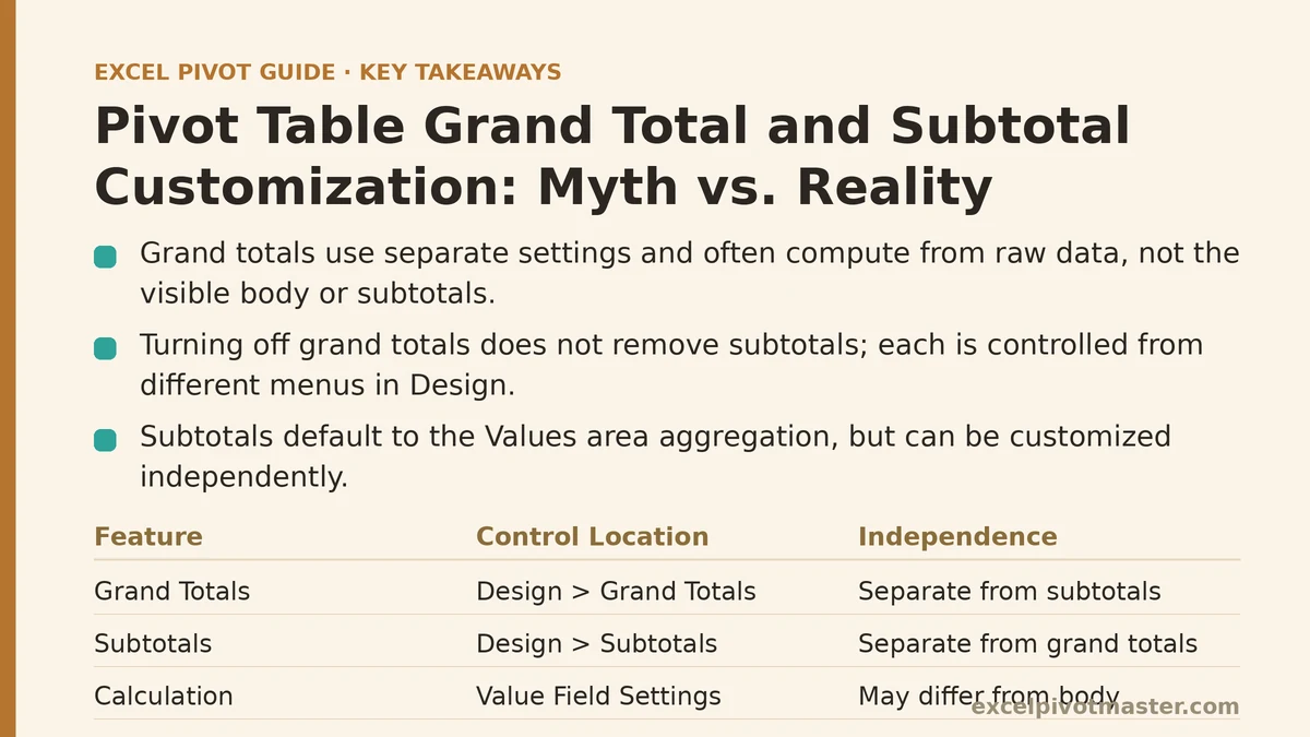
Myth: The Grand Total Row Always Uses the Same Calculation as the Values Area
This is the myth that causes the most damage, because it’s wrong in a specific and non-obvious way. The grand total does not automatically inherit whatever aggregation you chose for the body of the pivot table. If your values are set to show as “% of Column Total,” the grand total row doesn’t display the percentage math applied consistently down the column — it displays 100%, because that’s what the whole column adds up to relative to itself.
The same disconnect shows up with averages. If your Values area is set to Average instead of Sum, the grand total isn’t an average of the visible subtotals — it’s the average of every individual record in the underlying data, calculated independently. Those two numbers can differ meaningfully, especially when group sizes are uneven. A department with three transactions and a department with three hundred don’t contribute equally to a simple average of averages, but they do contribute proportionally to a grand total calculated from raw records.
Reality: Right-click the grand total cell and check Value Field Settings to see exactly what’s being calculated, rather than assuming it mirrors the body of the table. When averages or percentages are involved, the grand total is very likely computed from the full dataset, not from the subtotals sitting above it.
Myth: Turning Off Grand Totals Also Removes Subtotals, and Vice Versa
These two live in completely separate places in the ribbon, and disabling one has zero effect on the other. Grand totals are controlled from Design, then Grand Totals, where you choose whether to show them for rows, columns, both, or neither. Subtotals are controlled from Design, then Subtotals, with options to show them at the top of each group, the bottom, or not at all.
Because both settings live under the same Design tab, it’s easy to assume they’re two views of one switch. They aren’t. You can run a pivot table with subtotals fully visible and grand totals hidden entirely, or the reverse — grand totals present but every subtotal suppressed. Neither configuration is unusual; the second one is common in reports where the reader only cares about category totals against a single company-wide number, without the visual clutter of a subtotal after every group.
Reality: Check both settings independently. If a total is missing or unwanted, confirm which of the two menus is responsible before assuming a single toggle handles both.
Myth: Subtotals Have to Use the Same Function as the Rest of the Pivot Table
By default, yes — a subtotal mirrors whatever aggregation is applied in the Values area, so a Sum-based pivot table produces summed subtotals. But that default isn’t a limitation. Under Design, then Subtotals, choose “Custom” instead of “Automatic,” and a checklist appears letting you select multiple functions at once: Sum, Average, Count, Max, Min, and several others, all stacked under the same group simultaneously.
This is useful more often than people expect. A sales report might want the summed revenue for a region alongside the average transaction size for that same region, without building a second pivot table or a separate calculated field. Selecting both functions under Custom subtotals produces two subtotal rows per group, each labeled with the function name so they’re not ambiguous on the page.
Reality: Subtotal calculations are independently configurable per field. The automatic match to the main aggregation is a starting point, not a ceiling.
Myth: A Blank or Zero Grand Total Means the Formula Is Broken
When a grand total shows zero, or shows nothing at all, the first assumption is usually a calculation error somewhere in the pivot table. Far more often, the cause is a filter — a slicer, a report filter, or a manually filtered field — that has quietly excluded every row that would have contributed to the total. The pivot table isn’t malfunctioning; it’s accurately summarizing an empty selection.
This is especially easy to miss with slicers connected across multiple pivot tables, since a slicer selection made in one report can silently filter a second pivot table sharing the same data source, producing a grand total that looks wrong in a table you didn’t even touch.
Reality: Before troubleshooting the calculation itself, check every filter and slicer touching that pivot table’s data source. A grand total of zero is frequently correct math applied to a filtered-down dataset, not a broken formula.
Myth: You Can’t Rename “Grand Total” to Something More Meaningful
The label reads “Grand Total” by default, and a fair number of users treat that as fixed text baked into the pivot table engine. It isn’t. Click directly on the cell containing the words “Grand Total” and type a replacement — “Company-Wide Total,” “Fiscal Year Total,” whatever fits the report — and Excel accepts the edit like any other cell label.
The one catch: this rename doesn’t survive a full pivot table rebuild or a change to the underlying field structure that forces Excel to regenerate the total row from scratch. It also won’t apply retroactively to a second grand total row if your layout has one for rows and one for columns — each needs to be renamed separately.
Reality: Grand total labels are editable text, not locked system labels, though the edit is local to that specific cell and specific layout.
Myth: Subtotals Can Only Appear as Rows, Never Alongside Values in a Compact View
This one comes from unfamiliarity with Report Layout options rather than any real restriction. Under Design, then Report Layout, switching between Compact, Outline, and Tabular form changes not just the visual arrangement of the pivot table but where subtotal rows sit relative to their group. Compact form nests subtotals tightly under a collapsed group; Outline and Tabular form spread the same subtotal into its own distinct row with a full label, which reads more clearly in printed or exported reports.
Layout choice also affects grouping in ways people don’t expect the first time they see it: Outline form repeats field headers across multiple columns, which some readers find easier to scan when there are three or four nested row fields, at the cost of extra width.
Reality: Subtotal placement is a layout decision, not a fixed structural rule. Trying more than one Report Layout option often resolves a subtotal that “looks wrong” without changing a single calculation setting.
Side-by-Side: What’s True and What Isn’t
| Claim | Myth or Reality | What’s Actually Happening |
|---|---|---|
| Grand total always matches the Values area calculation | Myth | Averages and percentages are often recalculated from raw data, not from subtotals |
| Disabling grand totals disables subtotals too | Myth | Each is controlled from a separate menu under Design |
| Subtotals must use the same function as the pivot table body | Myth | Custom subtotals allow multiple simultaneous functions per group |
| A blank grand total means the formula is broken | Myth | Filters and slicers are the more common cause |
| “Grand Total” can’t be renamed | Myth | It’s an editable cell label, though local to that layout |
| Subtotal placement is fixed | Myth | Report Layout settings change where and how subtotals display |
If there’s one pattern running through all six of these, it’s that grand totals and subtotals are far more independently configurable than their shared location on the Design tab suggests. Most of the “wrong” totals people report turn out to be correctly calculated answers to a question the settings were quietly asking without anyone noticing.
Which of these settings is behind the total you’re currently troubleshooting? Narrowing that down first usually saves a lot of unnecessary formula-checking. Related guides: Excel Pivot Table Layout Styles: Compact vs Outline vs Tabular Explained, 5 Pivot Table Setups Every HR Analyst Needs for Headcount and Attrition, and Excel Pivot Table Common Errors and Fixes: A Real Troubleshooting Walkthrough.